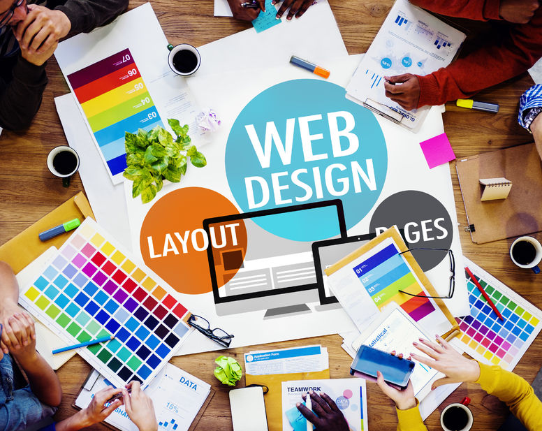
Web design can sometimes seem overwhelming, especially with all of the components involved.
Let’s Simplify It
Web design doesn’t have to be as scary or messy as it may appear. Back before WordPress (and other platforms) people did it by hand… hand coding the HTML. I still do that, but seriously, back in those days, it was scary and messy!
Thankfully, we have come a long way. Now we have tools like WordPress (and others) and that takes a lot of the complication out of it. I dare say, at least 80% of the complication out of it.
Now you just have to make a few decisions on what you want for the design of your site. You need to sort of immerse yourself into the project until you find yourself, and more importantly that website design.
Design That Suits Your Business AND Your Visitors
We are going to use dental sites to demonstrate our point(s). We all understand who dentists are, right? So, it is a great place to start to try to figure out what we like and what might work for our site.
Design is so important when you are developing your brand, as well as strategizing your traffic. A great example of an appealing design is Dentist in Apex (NC) (designed by the Dental Marketing Guy. If you notice, right away, the design grabs you and makes you want to come into the website, as if you are coming into the office yourself. And, that is the point, isn’t it?
When you click on a link to visit a site, the owners of the site want you to take action (or at least WANT to take action). And, this site definitely draws a person in, as if opening the door and drawing you in personally… Do you see how the gal takes the hand of the little girl? Very effective in a design concept!
Another design has a more structured, formal appeal, and that is Lane Dental. If you notice, in all of both cases, the site design matches the brand of the owner of the site. It also contains the essential components, such as navigation, contact information, and an about page or about box. This allows you to know what to expect before visiting that dentist! (And that probably helps to take some of the anxiety out of the way!)
The Very Important Brand Kit!
Another key thing to note, which sadly I’ve noticed even some professionals discard, is that the designer has been careful to follow the brand kit. They have either determined the brand kit (e.g., brand colors, fonts, etc.) ahead of time, or reverse engineered it from what the company has been using, and stuck to it in the design elements. Whether we humans know how to define it in all cases or not, subconsciously, we DO recognize it and it is important. It helps us to feel aligned, comfortable, and at ease. (Trust me, that comes from my background in design, as a part of my IT education and my almost-completed doctorate in psychology!)
BTW – On the topic of dentist sites, there is a really cool one for kids, at Pediatric Dentist in CO with fun shapes and colors that may appeal to children. Hey, they appeal to me, as an adult! It makes me want to go there.

“What Do I Need to Do to Get My Site Up and Running?”
You have a few choices. Let’s brainstorm them. Certainly, as we are going through this list, add to it with your own ideas:
- Hire a web designer (not to be confused with web programmer). This can help you pull all the right pieces together (if you find the right designer), but it does cost money. Though, it could save you time if you have a busy day job.
- Strategize your own site design. There are plenty of websites available online that walk you through the different components that you need and what you may want.
- Do some research. Don’t copy other people’s sites, but find sites that you like and decide on one that you want to sort of match.
- Work with the templates that come with your WordPress (if that is what you are using). There are plenty of free templates. Some of us are using Genesis or Thesis and they have free “skins” as well. By working within those constraints, you understand what works and doesn’t work. That sure beats trying to design something with a template that doesn’t work.
Summary
The key thing here is that you want your design to be what you want it to be for you and your target audience. If you want warmth, go for warmth. If you want strong and statured, go for that. If you are not sure how to find it, search the internet until you find a site that represents what you want. And, don’t forget, having a logo helps to get the ball rolling. I start with that, before the design. It helps to designate my colors.
Comments on this entry are closed.
Great post. Well explained and clear to understand. Thanks a bunch for sharing such a useful article with us. Keep up the good work.